
Myntra Old Logo Controversy: The Full Story Behind the 2021 Change
Have you ever looked at a picture and seen one thing, while your friend sees something totally different? That is exactly what happened with the myntra old logo. For many years, we all saw a bright, stylish “M” that stood for India’s favorite fashion store. But in early 2021, one person’s observation changed everything for the brand.
It is quite fascinating how a small design can cause such a big stir. Most of us used the app daily without thinking twice. Then, almost overnight, the logo became the center of a national conversation. This story isn’t just about a brand update; it’s a lesson in how people see art and how quickly a company must act when feelings are hurt. Let’s dive into the details of what really went down!
The Big Detail: Myntra Logo History and Facts
| Feature | Myntra Old Logo (2015-2021) | Myntra New Logo (Current) |
| Main Symbol | Overlapping shades of pink and orange in an “M” | Overlapping shades with adjusted color blocks |
| Key Complaint | Perceived as “obscene” or offensive to women | Cleaned up to remove suggestive overlaps |
| The Designer | Internal Branding Team | Internal Branding Team (Revised) |
| Change Date | January 2021 | January 2021 |
| Reason for Change | Police complaint by an activist | Response to public sentiment and legal pressure |
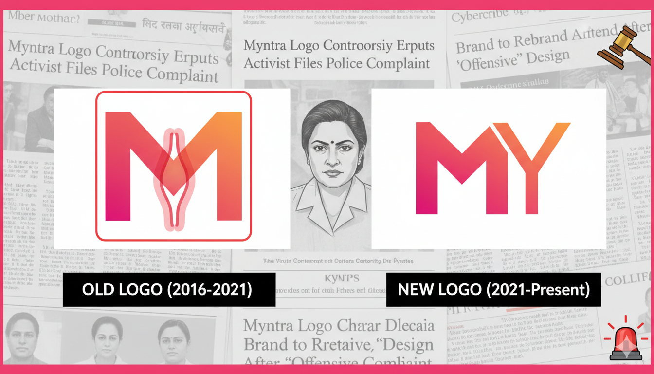
What Did the Myntra Old Logo Actually Look Like?
The myntra old logo was a very recognizable symbol. It featured a bold letter “M” made of different shades of pink and orange. These colors were meant to represent energy, fashion, and joy. The parts of the letter overlapped each other, creating a layered look that felt modern at the time.
For over five years, this logo was everywhere—on our phone screens, on those big delivery bags, and on TV ads. Most shoppers thought it was just a colorful way to show the first letter of the brand name. It was simple, bright, and easy to remember. However, the way those colors overlapped in the center of the “M” is what eventually led to a massive debate across social media.
The Complaint That Changed Everything
In December 2020, a woman named Naaz Patel, who runs an NGO called the Avesta Foundation, filed a official complaint with the Mumbai Cyber Police. She claimed that the myntra old logo was “indecent” and “offensive to women.” She argued that if you looked at the logo in a certain way, it appeared to show a woman in an inappropriate pose.
This might sound surprising to many, but the police took the complaint seriously. They met with the team at Myntra to discuss the issue. Even though the brand didn’t design the logo with any bad intentions, they realized that once someone “saw” the offensive image, it was hard to “unsee” it. This led to a very quick decision to protect their reputation.
Why Did Myntra Change Its Logo So Fast?
Usually, when a big company changes its look, it takes months or even years of planning. But with the myntra old logo controversy, things moved at lightning speed. Within just a few weeks of the police complaint, Myntra agreed to refresh its branding. They didn’t want to get stuck in a long legal battle or face a boycott from their customers.
By acting quickly, Myntra showed that they value the feelings of their audience. They chose a path of “peace over pride.” Instead of fighting back and saying the complaint was “bizarre” (as many netizens did), they simply fixed the problem. This helped the brand stay focused on what they do best: selling clothes!
The Difference Between the Old and New Logo
If you aren’t looking closely, you might not even notice the difference! The brand kept the same pink and orange color scheme and the same “M” shape. The main change in the myntra old logo vs. the new one is the way the colors overlap.
In the new version, the designers shifted the color blocks. This removed the specific shape that people found offensive. It was a subtle tweak, but it was enough to satisfy the legal requirements and the activists. It’s a great example of how a tiny change in a drawing can make a huge difference in how a multi-million dollar company is perceived by the world.
The Social Media “Meme Fest”
When the news broke about the myntra old logo change, the internet went wild. Thousands of people started making jokes and memes. Some people thought the change was unnecessary, while others were surprised they had never noticed the “hidden” shape before. Hashtags like #MyntraLogo began trending on Twitter for days.
Even other brands joined in on the fun! It became one of the biggest viral moments of 2021. While some people debated the “seriousness” of the complaint, most users just enjoyed the funny pictures that compared the logo to other random objects. It was a rare moment where a corporate branding change became a piece of pop culture history.
What Designers Can Learn from This
For people who draw and design things for a living, the myntra old logo is a famous case study. It teaches us that “context is everything.” What looks like a simple overlap to one artist might look like something completely different to someone else. It is always important to look at a design from every possible angle—literally!
Designers now use this story as a reminder to do “sensitivity checks.” Before launching a logo to millions of people, it’s a good idea to show it to a diverse group of people to see what they perceive. It’s better to find a potential issue early than to have to reprint millions of delivery boxes like Myntra had to do.
The Cost of Changing a Brand Identity
Changing a logo isn’t free. Think about all the things that have the myntra old logo on them. There are the physical signs at their offices, the uniforms for delivery partners, and millions of plastic and cardboard shipping bags. Myntra had to update their digital app and website, which was the easy part.
The hard part was phasing out all the old packaging. They decided to use up their existing stock of bags to avoid waste but promised that all new orders would feature the updated “M.” This shows that even a “simple” change has a huge ripple effect on the environment and the company’s bank account.
Is the New Logo Better for Business?
In the long run, the change didn’t hurt Myntra at all. In fact, many experts think the controversy actually gave them free advertising! Suddenly, everyone was talking about Myntra. Because they handled the situation gracefully and didn’t argue, they came out looking like a brand that listens to its community.
Today, most people have forgotten why the change even happened. The new logo works perfectly on mobile screens and looks sharp. It still carries the “fashion-forward” vibe that the myntra old logo intended, but without the baggage of a controversy. It’s a win-win for everyone involved.
Other Brands That Faced Logo Issues
Myntra isn’t the only one! Over the years, many companies have had to rethink their symbols. For example, Airbnb once faced comments that their logo looked like a heart (or other things!), but they chose to stick with it. Amazon also had to make a tiny change to their “smile” logo because the tape on the box looked like a certain historical mustache.
These stories show us that logos are more than just pictures. They are symbols that live in our minds. When a brand like Myntra changes its look, it’s a big deal because we see those symbols every single day. It’s all part of the wild and colorful world of modern business.
Conclusion: A Lesson in Listening
The story of the myntra old logo is a great reminder that brands are built on trust and respect. By choosing to update their look, Myntra prioritized their customers’ comfort over their original design. It was a bold move that turned a potential crisis into a smooth transition.
Whether you think the complaint was valid or a bit over-the-top, you have to admit that the way Myntra handled it was professional. They kept their colors, kept their identity, and kept their fans. Now, we can all get back to what really matters—finding the perfect pair of shoes on their app!
Frequently Asked Questions (FAQs)
1. Who filed the complaint against the Myntra old logo?
A social activist named Naaz Patel, who is the founder of the NGO Avesta Foundation, filed the complaint in Mumbai.
2. What was wrong with the old Myntra logo?
The complaint alleged that the color scheme and the way the letter “M” was designed were obscene and offensive toward women.
3. When did Myntra change its logo?
The brand officially announced and rolled out the updated logo in January 2021.
4. Did Myntra change its name too?
No, the brand name remained exactly the same. Only the visual design of the letter “M” in the logo was modified.
5. Is the Myntra old logo still used anywhere?
You might still see it on very old packaging or old blog posts, but the company has replaced it on all its official platforms and new delivery materials.